David Carson: the Art of Chaos that changed graphic design

by Reo Aromi

Imagine flipping through a magazine where words seem to dance, images overlap like wild waves, and reading becomes a sensory experience rather than a simple act. This is the universe of David Carson, the “godfather” of grunge typography and one of the most iconoclastic designers of the 1990s.

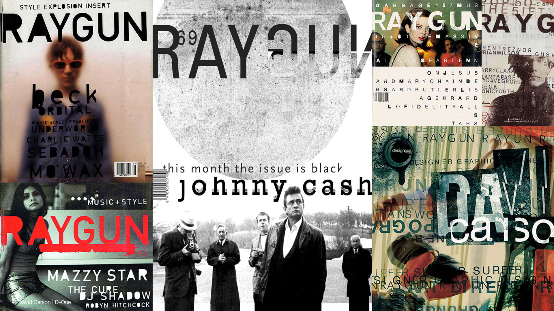
Carson’s story is, in itself, a manifesto against convention. Born in 1955 in Corpus Christi, Texas, he earned a degree in Sociology from San Diego State University. At 26, he enrolled at the Oregon College of Commercial Art and attended a workshop in Switzerland that would shape his design approach. But before all that, he was a professional surfer, ranking ninth in the world in 1989. A mix of waves, sociology, and creativity that would ultimately revolutionise editorial design.


In 1992, he became the art director of Ray Gun, an alternative music magazine. There, Carson abandoned traditional grids and began subverting every rule: rotated text, overlapping words, distorted images. The result? A visual chaos that conveyed the energy of alternative rock better than a thousand words. Ray Gun didn’t even have page numbers: to read it, you had to tilt the magazine or squint to decipher the headlines. An immersive experience, almost like a performance.


Carson earned the nickname “Godfather of Grunge Typography” for his anarchic approach to layout. He used “dirty,” blurred, distorted typefaces as if torn from a protest poster. His pages looked more like collages of emotion than meticulously planned layouts. A visual language that spoke directly to young readers of the ’90s, raised on MTV and with fleeting attention spans.

A fearless designer, Carson has always waged war on perfection. He openly criticised the use of Helvetica, calling it a “lazy” choice. For him, design had to be emotional, not just functional. He worked for clients such as Nike, Pepsi, MTV, Levi’s, and created album covers for Nine Inch Nails and David Byrne. In 2014, he was awarded the AIGA medal, one of the highest honours in design.


The Beauty of Disorder.

Looking at his work today, it’s clear that his aesthetic was never just “chaotic.” It was controlled chaos—a search for meaning through imperfection. Carson proved that graphic design can be poetry, music, sensation. An invitation to look beyond the rules and experience with your eyes.


If today we flip through a magazine and feel as if the images and words are talking to each other, we have to thank the person who dared to break the rules.

And that person is David Carson.


Author: Reo Aromi

Images © David Carson